Under construction — not yet public. This page is shared for review only and is not linked from any menu.
A proposal prepared for discussion, and for sharing with the Isaac Newton Institute, University of Cambridge.
Visual identity designed by Gilles Baroin, PhD — Université de Toulouse · MatheMusic.net
Released to the INI under Creative Commons, credited at each use.
A note on this document
This is a short set of recommendations for using the event’s visual identity well. It is offered in a collaborative spirit — not as rigid rules, but as the guidance that keeps the mark clear, consistent and recognisable across everyone’s work, from the INI web team to printers and partners. Where exact production values are needed (colour references, vector files), they are provided in the accompanying asset pack. For anything not covered here, or any new application, the designer is glad to help.
1. The identity at a glance
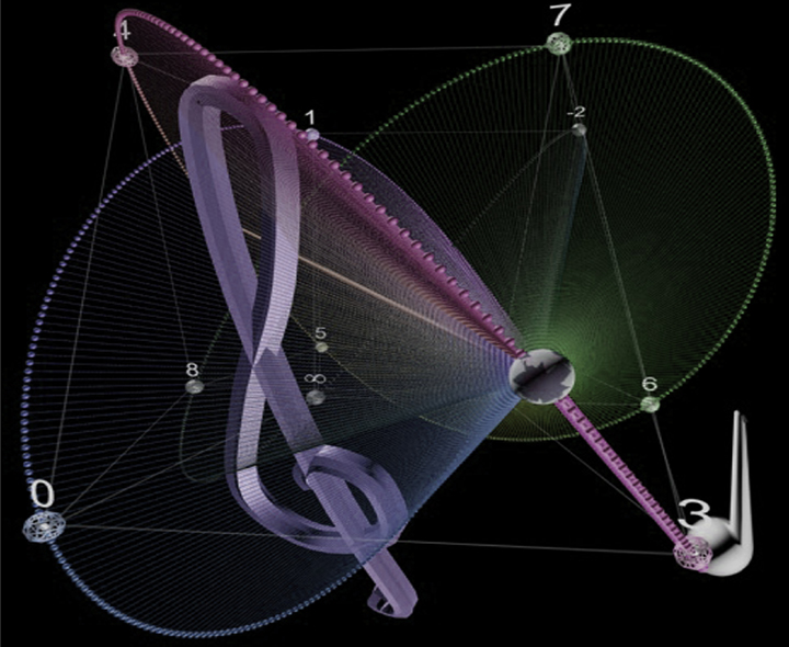
The identity is built on a single mark: Newton’s chromatic circle enclosing a four-dimensional chord model, with a treble clef and Newton’s fluxion notation. It is supported by a small, deliberate system — one or two type families, a restrained palette, and the twelve Newton colours as the only strong colour. The full story of the mark is documented separately; this document covers its use.
The principle behind every recommendation below: let the mark and its colours do the work, and keep everything around them quiet.
2. The master logo
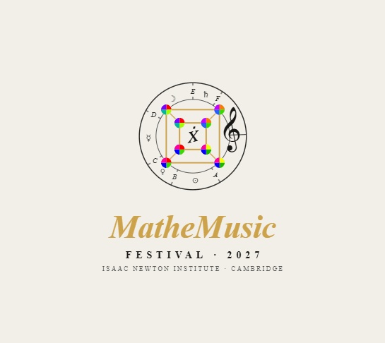
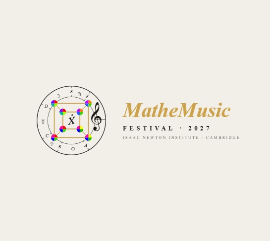
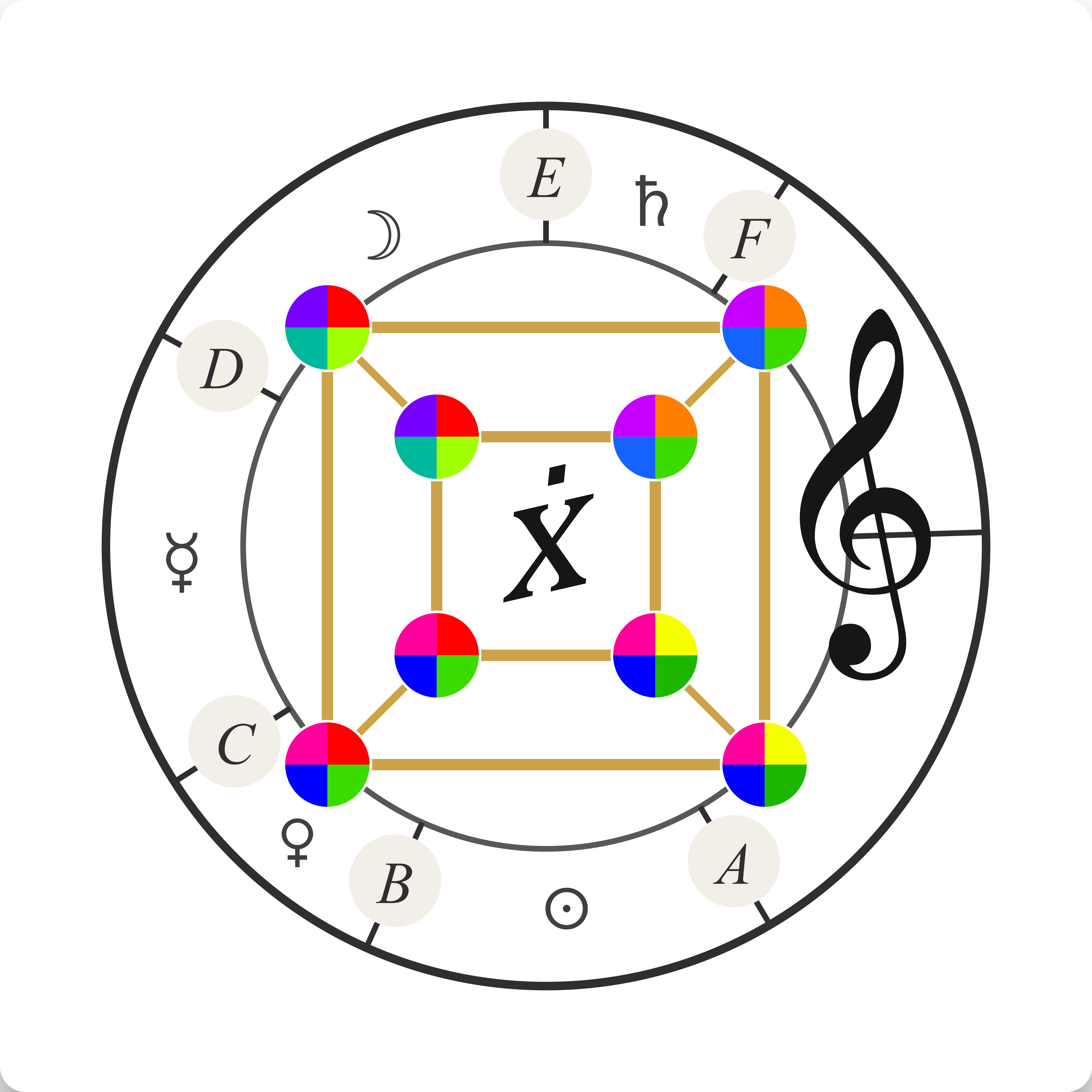
The master logo should be used wherever possible, in preference to redrawn or simplified versions. It exists in two arrangements:
- Lockup A — mark with wordmark beside it. For horizontal spaces: web headers, letterhead, email signatures, the top of documents.
- Lockup B — mark with wordmark below it. For upright and centred spaces: posters, title pages, programme covers, social avatars.
Both arrangements are supplied ready-made. Please use the supplied files rather than re-typesetting the wordmark or re-spacing the elements.
All lockups — download

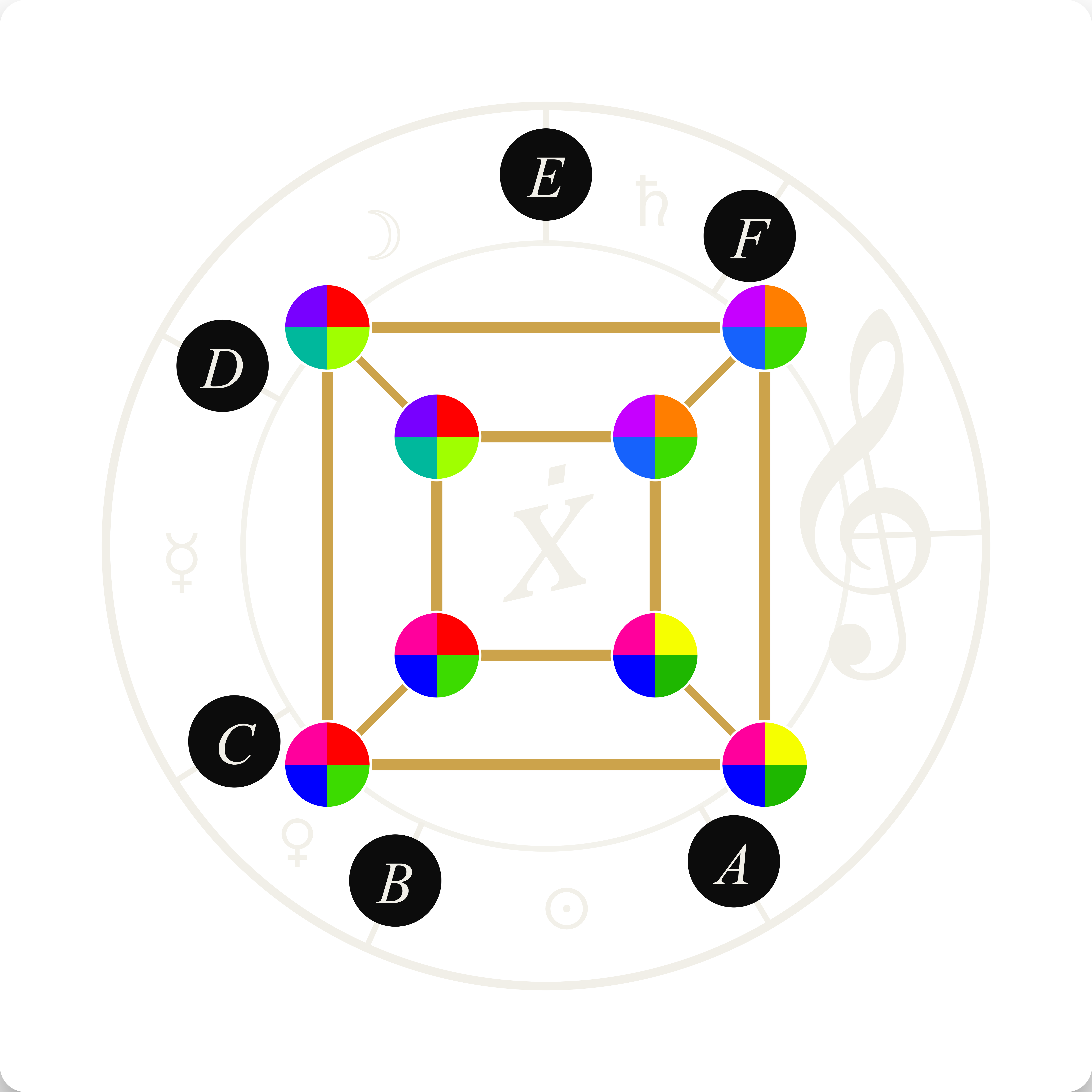
Mark only (transparent) — download
⬇ Download — Mark only, transparent, PNG 5400px | ⬇ Download — Mark only, transparent, SVG | ⬇ Download — Mark only, black, PNG 5400px | ⬇ Download — Mark only, black, SVG


3. Clear space
Always leave a margin of clear space around the logo, free of text, other logos, or busy imagery. As a simple rule, keep clear space at least equal to the height of the wordmark’s capital letter on all four sides. More space is always welcome; less begins to crowd the mark.
4. Minimum size & the detailed mark
The mark is intentionally rich — the chromatic ring, the planetary glyphs, the chord nodes and the clef. That detail rewards a generous size but can blur when very small. Recommendations:
- Full logo: use at roughly 30 mm wide or more in print, and 150 px wide or more on screen.
- Below that size, use the compact version (mark alone or shortened wordmark) for favicons, app icons and footnotes.
5. Colour
- A quiet ground (charcoal or off-white) — the identity holds on both.
- Gold — for the structure of the mark and the wordmark.
- Black — for the stage behind any three-dimensional model imagery.
- The twelve Newton colours — never substituted or recoloured.
6. Typography
- A display serif with a historical, engraving-era character — for the wordmark, titles and captions.
- A clean sans — for body text, labels and all functional information.
The wordmark should always come from the supplied logo files and never be re-typed.
7. Backgrounds
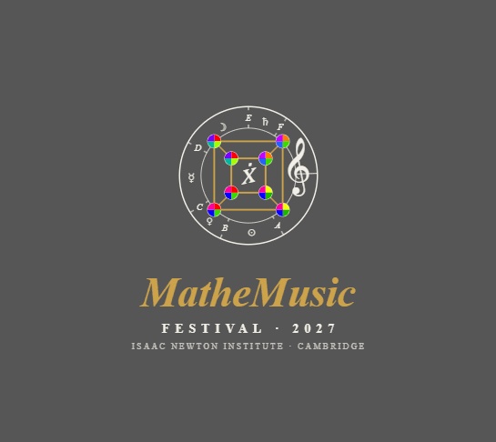
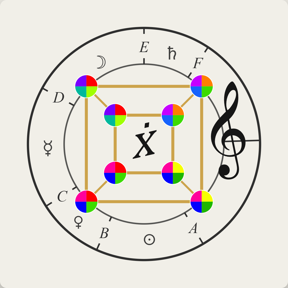
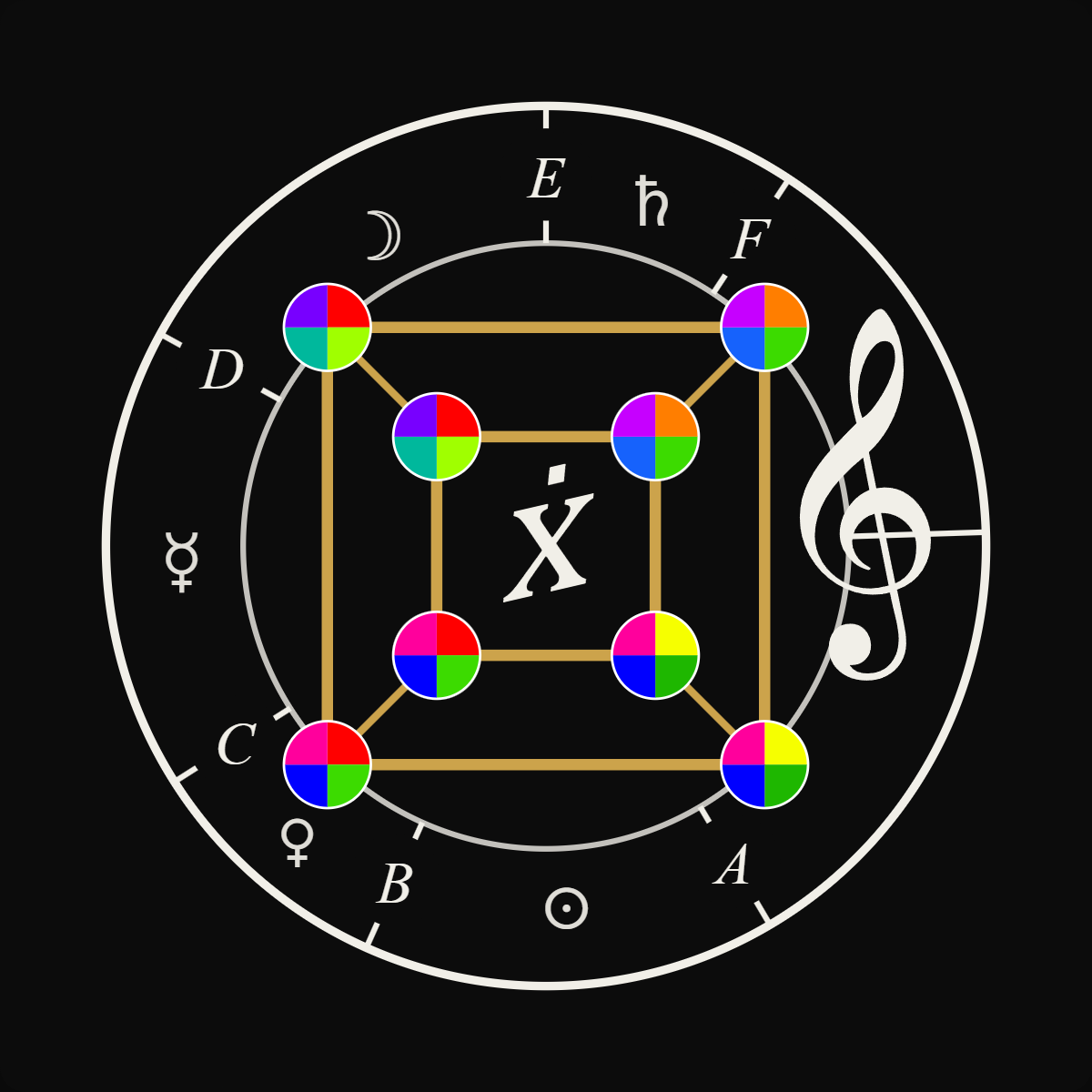
- Choose the version whose background matches the surface, for maximum contrast.
- Avoid placing the logo on busy photographs or low-contrast colours.
- If the logo must sit on an image, use a plain panel or a sufficiently dark/light area behind it.
8. Working with the Institute’s branding
On event materials, the event identity and the institutional logos (Isaac Newton Institute, University of Cambridge, and partners) should sit together comfortably and as equals — typically aligned along a footer or a clear band, each with its own clear space, none crowding the others. The event mark leads on promotional materials (posters, web, social), while the institutional logos lead on official and administrative materials. Final placement should follow the INI’s own brand guidelines, which take precedence on their channels.
9. Please avoid
- Recolouring the mark, or changing any of the twelve Newton colours.
- Stretching, squashing, rotating or adding effects (shadows, outlines, glows).
- Re-typesetting or rebuilding the wordmark in another font.
- Placing the logo on a busy or low-contrast background.
- Crowding the logo with text or other logos inside its clear space.
- Recreating the mark by hand — always use the supplied files.
10. Files provided
- All lockups (8): see download section above
- Mark transparent: ⬇ Download — PNG 5400px · ⬇ Download — SVG
- Mark black: ⬇ Download — PNG 5400px · ⬇ Download — SVG
- Light ground 1200px: ⬇ Download — PNG
- Black ground 1200px: ⬇ Download — PNG
11. Licence & contact
The identity is provided to the Isaac Newton Institute under Creative Commons, free of copyright constraint, on the single condition that the designer is credited each time the identity is used.
Gilles Baroin, PhD — Université de Toulouse
gilles@baroin.org · www.MatheMusic.net
Prepared as a proposal for discussion. Nothing here is fixed; the recommendations are offered to the Institute in a collaborative spirit, to be refined together.
Visual identity by Gilles Baroin, PhD — Université de Toulouse · MatheMusic.net · Released under Creative Commons, credited at each use.